AI Logo Generator, Logo Maker
- 4.8
- Rating
- 1.00M
- Installs
- Free
- Price
 Analysis by App-foxy
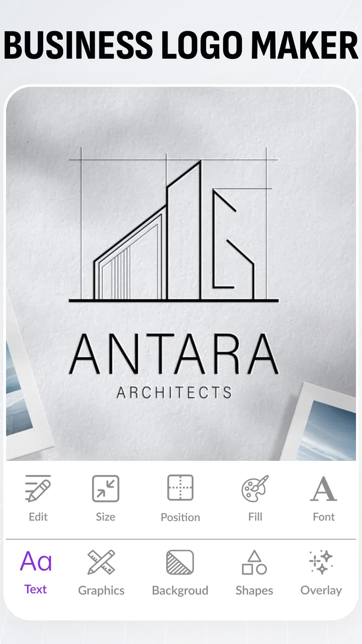
I usually judge a logo app by what happens after the first attractive template: can I make something recognisable, adjust it without fighting the interface, and leave with a mark that still looks good outside the app? Logo Maker, AI Logo Generator from Apps You Love is aimed at that practical problem. It is a free Art & Design app for creating logos on an Android phone, with artificial-intelligence-assisted generation positioned as part of the experience. After spending time with it, I see it as a useful starting point for personal projects, small online shops, social profiles, clubs, and anyone who needs a presentable identity without opening a full desktop design suite.
The important distinction is that this is not a replacement for a professional branding workflow. I would use it to explore directions quickly, prepare a usable first logo, or make a simple visual identity when time and budget are limited. I would not treat the first result as a finished brand system. Its value is in reducing the blank-page problem and making experimentation approachable, while the final quality still depends heavily on how carefully I choose, edit, and check the design.
How the app feels in real use
I find the app easiest to judge when I treat it as a place to explore possibilities, not as a machine that makes every branding decision for me. In this section, I’ll focus on how its mobile-first approach shapes a real design session and why a little preparation can make the difference between a useful draft and a pile of unrelated ideas.
You May Also Like

 Blood Strike: 2.5 Anniversary
Blood Strike’s Loadouts Turn Every Drop Into a Tactical Gamble
A close look at Blood Strike’s custom loadouts: how fast access to signature weapons reshapes its battle royale rhythm, rewards preparation, and narrows the gap between fights.

 Pandora - Music & Podcasts
Pandora’s Music Is Easy to Start, but Harder to Recover
Pandora’s strength is its low-effort path from a seed to a station. Its weak spot is how much confidence it asks you to place in connection, setup, and quiet recovery.

 8 Ball Pool
 Is Built on Rivalries, Rematches, and Routine
A close look at the rivalries, rematches, shared routines, and unanswered safety questions that turn a quick pool match into a persistent mobile community.

 Samsung Music
’s Quiet Strength Is Playing What You Already Own
Its reach comes less from spectacle than from dependable access to a personal library. That simplicity is both the app’s strongest retention engine and its ceiling.

 AccuWeather: Weather Radar
AccuWeather Review: A Quick, Clear Forecast for Everyday Decisions
For everyday plans, the best forecast is the one you can understand quickly. AccuWeather makes rain timing, radar, and local conditions easy to act on, with a few trade-offs.

 Hill Climb Racing
Why Hill Climb Racing Still Turns Crashes Into One More Run
A tiny car, a bumpy hill and one more upgrade: Hill Climb Racing keeps resurfacing because its simple chaos makes every near-miss feel personal.
More From Our News Desk



Speed expectations when starting from a blank idea
The quickest way to get value from the app is to arrive with a basic idea already in mind. I might know the business name, a preferred mood, and one or two symbols I want to avoid. That preparation matters because a logo generator can offer many directions, but it cannot decide what the brand should mean for me. Once I have that foundation, the app is more useful as a visual sketchbook than as an automatic branding expert.
For a casual project, the experience feels naturally suited to short sessions. I can try a few visual approaches, compare them, and return later with a clearer preference. That makes it a good fit for someone creating a profile image during a lunch break or preparing a small event identity on a phone. I would not expect every generated concept to be equally strong. The practical speed comes from getting several starting points quickly, not from receiving a perfect logo with no decisions left to make.
I found that the best results come from narrowing the brief before browsing. A name with several unrelated ideas can lead to designs that look busy or generic. A simple direction such as “clean lettering with one memorable shape” gives me a better basis for judging the output. I also recommend deciding where the logo will appear first. A mark for a tiny social avatar needs different priorities from one intended for a shop sign or a presentation cover.
The real time-saver is not accepting the first attractive design; it is using the app to eliminate weak directions quickly. I look for a silhouette that remains recognisable when reduced, lettering that can be read without zooming, and a symbol that does not depend entirely on decorative effects. This approach makes the generator more useful than endless browsing through templates because every option is judged against a real purpose.
What happens during heavier design sessions
Light use is straightforward, but longer sessions expose the normal friction of mobile design. When I keep changing colours, type choices, layouts, and decorative elements, the creative process becomes less about generating and more about comparing. That is where a phone screen can feel restrictive. Small differences in spacing are harder to judge, and a design that looks balanced while editing may feel crowded once viewed as a small profile image.
I recommend taking screenshots or saving clear candidates as I go, then comparing them outside the active editing flow. This is a useful habit because the most recent design often feels best simply because I have just worked on it. Seeing several versions together makes recurring problems easier to spot: similar shapes, weak contrast, excessive detail, or lettering that disappears at a distance. It also prevents me from rebuilding a promising direction after moving on too quickly.
For a small business owner, a realistic workflow would be to create three families of ideas rather than dozens of disconnected logos. One family could focus on typography, another on a symbol, and the third on a combination of both. I would then choose one direction and make restrained adjustments. Constantly adding icons and effects may make the logo feel more “designed,” but it often reduces clarity. The app is most effective when I use its variety to explore, then apply discipline during refinement.
Longer sessions can also make resource demands more noticeable, especially if I keep multiple design attempts open or work on a device with limited free storage and memory. I cannot sensibly promise identical behaviour on every phone, because performance depends on the handset and the complexity of the work. My practical advice is simple: close unrelated apps before a serious session, keep the operating system current, and save important work rather than assuming the current editing state will always be recoverable.
Reliability and recovering from an interrupted session
Reliability matters more to me than a flashy first screen. A logo project can represent hours of small decisions, so I prefer a cautious workflow. I save versions at meaningful stages: the first acceptable concept, the cleaned-up layout, and the final variation with the chosen colours. Naming those files clearly is also worthwhile. “Final logo” is rarely enough when I later discover that I need a dark-background version or a simpler profile image.
If an interruption occurs, I would first reopen the project calmly rather than immediately repeating every edit. Check whether the latest saved version is present, then compare it with any exported or captured alternatives. This recovery habit is especially important when working while travelling, switching between apps, or designing on a battery-saving device. The app can make creation convenient, but convenience should not be confused with a complete backup strategy.
I also avoid leaving a critical project at the very last step. Before closing the app, I make sure I have a usable copy and that the chosen design is legible at a small size. This is not glamorous advice, but it prevents the common mistake of spending time polishing a logo and then discovering that the only version available is an unfinished draft. For an informal club or personal page, that may be a minor annoyance. For a paid client or a launch deadline, it can become a real problem.
The app’s broad audience is reflected in its content rating of Everyone, which makes it approachable for general users and younger creators working on suitable projects. The developer is Apps You Love, and the app has built a substantial audience: it has a 4.9 average from around 69 thousand ratings, with more than a million installs. Those figures suggest strong public interest, but they do not remove the need to test the workflow on my own device or to judge the designs critically.
Device constraints worth considering
Compatibility starts at Android 8.0 or later, so the app is available to many older phones as well as current devices. That is helpful if I am using a spare handset for a small business or do not want to replace a perfectly functional phone just to make a logo. At the same time, an older compatible operating system does not guarantee identical responsiveness. The age of the phone, available memory, screen size, and remaining storage can all change how comfortable editing feels.
A smaller display is not necessarily a deal-breaker, but it changes the kind of work I would attempt. Simple wordmarks and clean symbols are easier to inspect than detailed illustrations. If I am making a design with fine lines, layered decoration, or closely spaced lettering, I want to check it on a larger screen before treating it as finished. A phone is excellent for generating and reviewing ideas; it is less comfortable for precise visual quality control.
Resource-conscious users should also think about how they work. I would avoid keeping a large number of unrelated apps active during a long design session, particularly on an older handset. I would also review the available storage before starting a project that involves many saved variations. These are general mobile habits, but they matter here because logo work encourages repeated experimentation and multiple exports.
The free entry point is a strong reason to try it, although in-app purchases range from $3.99 to $79.99 per item. That broad range means I would pay close attention to the exact purchase screen and whether a particular tool or asset is necessary for my project before confirming anything. Someone who only needs a simple personal mark may be satisfied without spending. A user building a commercial identity should decide in advance how much the finished result is worth and avoid allowing optional upgrades to drive the design process.
Where it beats familiar alternatives
Compared with drawing a logo from scratch in a general graphics editor, this app lowers the initial barrier. I do not need to construct every shape manually before seeing whether an idea has potential. Compared with a desktop design program, it is more convenient for quick exploration and casual work. Compared with a conventional template library, the AI-oriented approach can feel more helpful when I have a rough concept but do not know which visual category to search.
Those advantages come with compromises. A general vector editor is usually the better choice when I need exact geometry, carefully controlled spacing, or a complete set of brand assets. A desktop workflow is preferable when several people must review the work, when colour consistency is important across many materials, or when the logo will be prepared for professional print production. A template-focused service may be better for someone who wants a predictable, polished layout with minimal experimentation.
I would also be cautious about originality. A generated concept can look appealing while still feeling close to familiar visual patterns. I check whether the icon is too obvious, whether the type treatment feels interchangeable, and whether another organisation could use the same idea without anyone noticing. A small adjustment to colour is not always enough to create a distinctive identity. Sometimes the strongest improvement is removing an unnecessary symbol and letting the name carry more of the recognition.
One of my favourite practical uses is creating a temporary identity for a project that may later become permanent. For example, I could prepare a logo for a weekend market stall, a podcast concept, a study group, or a new online shop while testing whether the idea attracts an audience. In that situation, speed and low commitment matter more than building a complete corporate identity on day one. If the project grows, I can use the chosen direction as a reference for a more rigorous redesign.
Who should use it, and who should skip it?
I recommend it to beginners who feel intimidated by design software, solo creators who need a recognisable mark quickly, and small teams that want several visual directions before choosing one. It is also useful for people who understand that a logo is a communication tool rather than a decoration. If I am willing to compare options, test small sizes, and remove clutter, the app gives me a practical path from vague idea to workable draft.
I would skip it as my main tool if I need editable professional vector files, detailed control over every curve, a formal brand guideline system, or dependable collaboration with a designer. I would also choose another approach if the logo is central to a major launch and must be unmistakably original. In those cases, this app can still help me collect references or explain a visual direction, but I would not rely on it as the complete production environment.
It is also not the right choice for someone who expects artificial intelligence to understand a complicated brand story without guidance. The more specific and thoughtful my brief, the more useful the suggestions become. If I simply press through options until something looks colourful, I may end up with a logo that is attractive for a moment but says very little. The app rewards active judgement, even though it is designed to make the first steps easier.
My performance verdict after using it
Logo Maker, AI Logo Generator is best understood as a fast, mobile-first idea and creation tool rather than a full professional identity studio. Its free availability, broad Android compatibility, accessible design focus, and large user base make it easy to consider for everyday projects. The current version is 135.0, and the app has been available since Mar 24, 2018, giving it a longer presence than a brand-new experiment.
My performance expectations are positive for short, focused sessions, with sensible caution around older hardware, long editing periods, and the need to save work deliberately. I appreciate that the app can help me move past a blank canvas, but I would not confuse a quick generated concept with a finished brand decision. The most reliable workflow is to create several restrained options, inspect them at the size where they will actually appear, preserve the best stages, and only then decide whether extra paid items are justified.
For a friend asking whether to install it, my answer would be yes if the goal is a usable logo draft, a personal project identity, or quick visual exploration on Android. I would explain that the strongest result will come from editing with restraint and checking the design outside the comfortable full-screen view. If the project demands precise production control or a highly distinctive identity, I would use this app for inspiration and move to a professional tool for the final work. That balance is where it earns its place: not as a magic shortcut, but as a convenient way to turn an uncertain idea into something I can evaluate and improve.
FAQs for AI Logo Generator, Logo Maker
01What is the primary function of the Logo Maker, AI Logo Generator app?
The Logo Maker, AI Logo Generator app is designed to help users easily create professional-quality logos using AI technology. It offers a wide range of templates, fonts, and design elements, allowing users to customize logos according to their needs, whether for business, personal branding, or other creative projects.
02Is the Logo Maker, AI Logo Generator app user-friendly for beginners?
Yes, the app is designed with an intuitive interface that is suitable for users of all skill levels, including beginners. It offers step-by-step guidance and easy-to-use tools, making the logo creation process simple and straightforward without requiring any prior design experience.
03What customization options are available in the Logo Maker, AI Logo Generator app?
The app provides a variety of customization options, including a vast library of templates, icons, fonts, and color palettes. Users can adjust the size, layout, and style to create a unique logo that aligns with their brand identity. The AI feature also suggests design improvements and alternatives.
04Are there any costs associated with using the Logo Maker, AI Logo Generator app?
While the app may offer a free version with basic features, premium features and content may require a subscription or one-time purchase. Users can choose from different pricing plans based on their needs, which often include access to exclusive templates and advanced design tools.
05Can I use the logos created with the Logo Maker, AI Logo Generator app for commercial purposes?
Yes, logos created with the app can typically be used for commercial purposes, such as for businesses, marketing materials, and websites. However, it is important to review the app's terms of service to ensure compliance with any specific usage rights or restrictions.
Pros
- Easy to use interface for beginners.
- Wide variety of templates available.
- Customizable color and font options.
- Quick export to multiple formats.
- Offline usage supported.
Cons
- Limited free design elements.
- Occasional ads in free version.
- Some features require premium upgrade.
- Limited AI customization options.
- In-app purchases can be pricey.

AI Logo Generator, Logo Maker
Gallery